I adore maps and so usually enjoy I Fucking Love Maps on Facebook. Every now and then they post something infuriating. Because one of the best ways to bypass people’s bullshit detectors is to put your bullshit on a map.
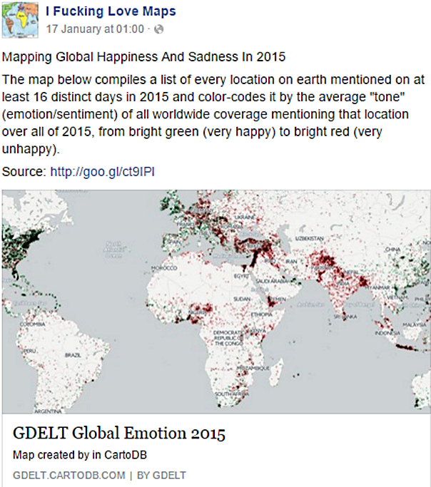
They’ve recently shared a project about “Mapping Global Happiness And Sadness In 2015” (project page here).

[Source]
I’ve looked before at the problems with compiling “global” indexes of happiness/well-being etc. There’s enough opportunity for bias and confounding factors in these studies. Here, the bias is on steroids. Here are just some of the ways this project, while being pretty useful and interesting, is NOT a mapping of global happiness and sadness:
- It only counts internet users, which still form less than 50% of the world population.
- It only counts Twitter users who posted within the last 16 days. According to sources, this is about 9.7% of internet users. Also the Twitterati are not a representative sample either of internet users.
- It only counts tweets that mention a location, which according to this study is about 2-3% of tweets. I think a tweet about crime/emergency might be more likely to include a location (eg. tweets about the Bacha Khan Uni bombing will generally mention a location). Whereas if you’re tweeting about something nice you might be less likely to say that you’re having a good time in Charsadda…
- It only counts tweets with sentiments picked up by the sentiment analysis algorithm. Without looking at their particular algorithm in detail, it’s unlikely to be perfect. If it has trouble detecting sarcasm (which is likely) then this will bias data in countries where culturally it’s more common to snark-tweet.
- Most importantly, it doesn’t take into account the cultural aspect of places where you’re supposed to put on a happy face (even if things are shite) compared to places where you’re expected to complain and not make yourself out to be some bigshot. Interpreting the map as measuring happiness assumes people everywhere are just as likely to tweet about their state of being — which is bullshit.
- Some countries also have very large communities using Twitter specifically to advocate for change. This would skew their sentiment towards the negative.
Some Facebook comments were rightly skeptical:

What are the sources for this? If it’s mainstream media coverage-based, then it shows how happy or sad reporters are
It probably shows a lot of cultural differences
Others showed how much people have pre-determined ideas about what the results “should” be:
Isn’t right about Turkey, just Kurds is unhappy in Turkey and they are on Middle+East; other Turkish lands is normal and happy
This may not be accurate. Being a highest crime and sad country how USA be so positive and being a happy and a family oriented and friendly country [India?] be so negative.
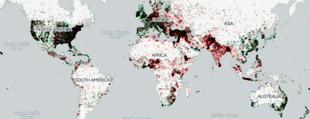
At a glance the map suggests that Australia, East and Southeast Asia, Western Europe (minus Germany), the USA, South Africa, the Caribbean and parts of Central America are happy. South Asia, most of sub-Saharan Africa, the Middle East etc are not. But zooming into their interactive map shows a rich tapestry with few data points per location so there may be a sampling issue in certain countries. On the other hand, the masses of red dots around Egypt, Syria, the West Bank, Yemen, Southeast Turkey, Yemen, Northeast Nigeria, Bangladesh, Northeast Pakistan and Burundi are almost certainly influenced by the terrible events that have been happening in those places.
It would be interesting to see an animation of this map every month or every quarter to see if some actual change can be correlated to changing world events — that might show if the map is robust. Until then, taking it at face value is pretty dodgy.


0 Comments