In the last decade, we’ve seen an explosion in the media of country-based rankings/indexes that are meant to measure more than “just” traditional economic metrics like GDP. While GDP is an important measure that tells us something about what’s going on in a region, it’s very easy to see that it misses a huge chunk of the bigger picture. That kind of stuff is a bit harder to see for something like the World Happiness Index. But we have to be skeptical. Not because these types of indexes are worthless (although some have huge problems) but because without a critical eye, they can become a lot more misleading than something like GDP.
What’s wrong with them generally?
An index is generally put together by gathering one or more metrics about a country, performing some kind of statistical analysis to give each country a final “score” and then publishing these scores in order, giving countries a “ranking”. This leaves a few issues:
- How good is the data? This is one that is brought up most of the time and there is acknowledgement that a lot of the data is crap. But as long as there’s a mechanism to account for this (eg. this one which allows up to 2 missing variables per country), it’s not a huge problem.
- How meaningful is the combination of data into a final score? This depends on what the index is trying to measure, but there is a problem around the transparency behind complicated indexes. Still, not a showstopper for most of these.
- Is there bias towards things that can be [easily] quantified? This is much more of a problem for indexes that try to measure messy concepts like happiness or goodness. The more multifaceted a concept is, the more important insights we’re likely to miss by a robust quantitative approach. This alone should lead us to be very skeptical of these indexes.
- What exactly is being measured? When measuring something that reflects a subjective topic, the choice of questions, base metrics plays an even more important role than in something like GDP.
- Is there a bias in “ranking” countries? When countries get ranked, this means essentially translating a numerical score that could be anything into a number that’s between 1 and about 190. This can easily have the effect of exaggerating differences between countries. Some country always has to be #30, even if it scored almost the same as #1. Rankings imply a certain mental model of the world: for me it is like a race or journey with the participants stretched out along a path. As if that doesn’t affect the way we interpret these lists and use them to influence public policy?
- Is there a just world fallacy problem? This is a consequence of the previous one but I was just thinking about how such rankings may justify inaction or worse. When we see someone suffering, we tend to adjust our beliefs to suggest that the person deserved it (this article in the Guardian is a great introduction). To what extent does seeing that Niger is #187 on the Human Development Index going to other people there, cement the perception that it’s a basketcase, become a case of stereotype threat and self-fulfilling prophecy etc? Of course any reporting around suffering is liable to make our just-world biases worse and it’s not like we can/should stop describing suffering. But I wonder how much more gratuitous it is for a quantified list that has the perception of objectivity but where someone must come 187th?
Each type of index has its own considerations too.
Human Development indexes
These tend to put together various metrics associated with human flourishing or at least the basics that people might need to live life. The Human Development Index considers “life expectancy, literacy, education, standards of living, and quality of life”. You’d be pretty hard-pressed to argue these are not very important measures of human development, but let’s see the results: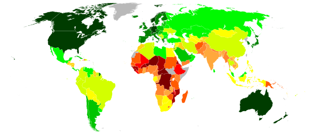
A few surprises here and there but overall it does seem to be a reasonable summary of those metrics. Already though, we can see some of the above issues with indexes start to play out:
- Australia is ranked #2 in the world. Yay! Except this is a country where a huge percentage of the indigenous population live in extremely poor conditions. This is of course covered up by the averaging out of the data; if Aboriginal Australia were a country I think it would be at least an orange. So inequality is not taken into account (even in a version that adjusts for inequality, Australia is still #2).
- Sri Lanka is placed in a fairly high category. Except that thousands of people are risking their lives at sea to flee persecution from there. In Saudi Arabia, half the population aren’t allowed to drive. In the USA, 13% of people can be murdered by police with no consequences. And so on. So we see that the easily quantifiable metrics are missing some pretty important aspects of human development.
Happiness indexes
This is one I looked at in an earlier post. Let’s look at one iteration, the Satisfaction with life index: 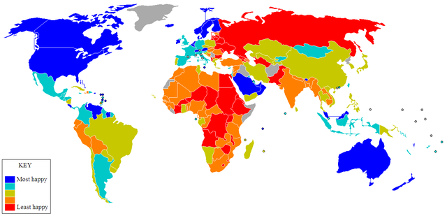
This one was calculated as a combination of asking people about their satisfaction with life as well as some quality of life metrics. Which is pretty different to the methodology and results of another happiness study which asked participants whether they “laughed, smiled, felt respected, experienced enjoyment or felt well rested the day before”.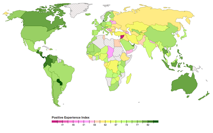
The first one tends to correlate a lot more with standard economic metrics (duh, since they were included!) with culture and possibly stochastic factors playing a much larger role in the second one. What the difference makes clear is that the field of happiness studies is still in its infancy. After all, what counts as happiness? The two studies actually map nicely to the two kinds of happiness described by Kahneman in Thinking, Fast and Slow. When we think about happiness (even our own), we conflate a longer-term evaluation of life satisfaction with our “in-the-moment” feelings.
There are also self-reporting: how happy are people expected to say they are in their culture? In some cultures you’re supposed to denigrate yourself more so as not to seem haughty, in others not so much. And of course a metric like happiness is particularly prone to the just world fallacy. It’s really hard to look at countries that are happy in the second chart (especially ones that are less rich) and not think they somehow “deserve it”.
“Goodness” indexes
This is a fairly new one that got attention in mainstream media in June 2014 with this TED talk where Simon Anholt explained the project (which you can find at GoodCountry.org). I’ll let the website introduce the concept:
The idea of the Good Country Index is pretty simple: to measure what each country on earth contributes to the common good of humanity, and what it takes away. Using a wide range of data from the U.N. and other international organisations, we’ve given each country a balance-sheet to show at a glance whether it’s a net creditor to mankind, a burden on the planet, or something in between.
While it’s interesting how countries affect others, this should clearly raise a few eyebrows. Which you can tell from how defensive they are in the description of the project.
It’s important to explain that we are not making any moral judgments about countries. What I mean by a Good Country is something much simpler: it’s a country that contributes to the greater good.
…
Q: It’s not fair to penalise poor countries by ranking them low in the Good Country Index: they would give more to the world if they had the money, time, skills, education, peace, health, etc.
A: For most indicators, each country’s score in the Good Country Index is divided by its Gross Domestic Product (GDP) so that smaller and poorer countries aren’t unduly penalised in the ranking for their limited ability to ‘make a difference’ in the world.Having said this, the Good Country Index isn’t passing any kind of judgment on countries, nor is it commenting on the reasons behind any country’s scores. It is certainly true that countries which need to focus on severe domestic challenges tend to be more concerned about their own populations and their own stability than those of other countries. Maybe this is right, and maybe it’s not: one for further discussion.
Of course it’s pretty hard to pretend to be completely objective since there is an inherent ideological basis for the whole thing (not that there’s anything wrong with that!).
Q: Did you try other normalisations such as GNI or per capita?
A: Yes. As it happens, the ranking is not hugely sensitive to different normalisations. A per capita normalisation is equally legitimate but it does tend to punish impoverished countries, which is something we wanted to avoid.
Personally I find the idea of a final score to be ridiculous. It’s not a balance sheet since it’s hard to juxtapose different factors (as they note) and ranking them equally is not some “neutral” decision. But for specific metrics I think the database is useful and I’d encourage you to look at those, and discover for example which countries are exporting the most arms, hosting less refugees than they should be etc.
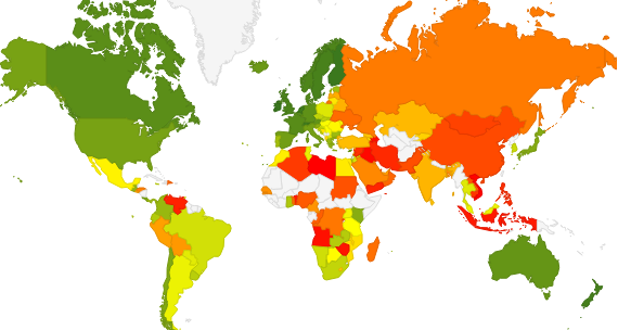
Below is a visualisation I made with the ranking of each country based on the index. The greener the country, the “gooder”, the redder the “badder”. I think it shows the problems with overall scores quite well:



0 Comments