
Before I mention the chart, a quick little reader experiment:
- Commit to an estimate of how many people in the UK die each year from falling off ladders. Try to avoid calculations, just go with your gut.
- Check your answer
- Commit to an estimate of how many children around the world die annually from malnutrition. Same rules.
- Check your answer.
- If you have a sec, please put your 2 estimates in the comments, otherwise scroll down.
Hopefully my cunning plan got you riled up, outraged and shocked at just how many children starve to death each year. Now onto the chart. This was a famous infographic published a while ago but I got a chance to look at it again. It basically contains several blocks of billions of dollars sized in proportion. Here’s a small version (omitting the bottom half most of which is the worst case cost of the GFC on the US government). Click on the picture to see the proper thing:
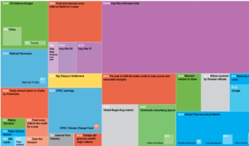
Now here’s a closeup of the bit I found particularly depressing:
It’s a truism repeated very often that the world produces more than enough to feed everyone on it. But this is really rubbing it in: private donations to US charities are basically enough to feed every child on earth 6 times over. Of course it’s not that simple. If sites about evidence-based giving (eg. GiveWell) have taught me anything it’s that there are no magic bullets. It’s not as simple as depositing $54B a year into a bank account and watching the annual child starvation rate plummet toward 0. On the other hand, it really is that simple. Contrary to popular self-serving beliefs about hunger, a huge proportion of deaths is from people who simply cannot afford to buy food. As an example, have a look at Benji Holzman’s post about meeting a typical woman who earns about the same as it costs to buy the daily sack of rice needed for her family. Millions have much less.
So the same thing is both depressing and hopeful. It’s really disheartening to see so much waste and misdirection and herding cats within the world of charitable giving. And yet the hope is that if we ever actually pull the finger out, it’s feasible to make world hunger go the way of some major diseases that we’ve forgotten thanks to vaccines. But if you want something practical, this chart highlights how important it is to do your homework when giving — to maximise the good that’s done.


0 Comments