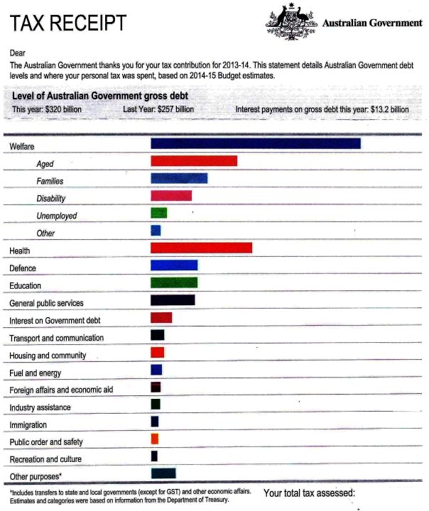
The Abbott government introduced a new page in Australian tax assessments that provides a breakdown of where your taxes go. I’m not sure whose idea it was but I really like the concept. It might be one of the only positive achievements of Abbott’s 726 days in office. But the way it’s executed is seriously misleading to be in line with the Abbott government’s agenda. Here’s an example tax return with the personal details and amounts deleted:

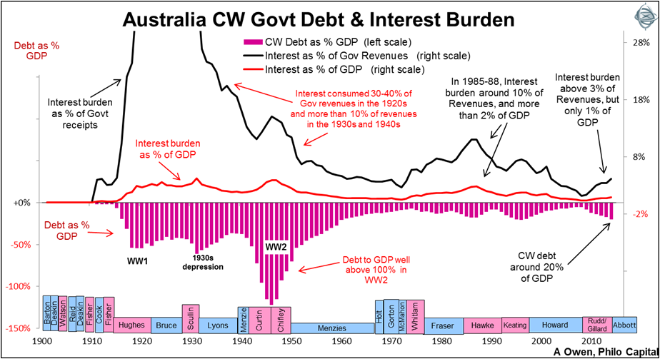
It starts off with some alarmist (ie. bold) text about the level of Australian Government debt. This is supposed to be a big deal, enough to warrant cutting important social services. Of course the interest on the debt is also itemised in one of the bars in the chart below. As you can see it’s a pretty small fraction of the whole thing (3.7% of this tax payment):

I’m no economist. I don’t even know why we’re only paying off the interest and not the principal. But I do know there’s been a lot of credible analysis that Australia’s debt is neither bad nor a reason for austerity (eg. see these articles in The Conversation). Plus Australia’s debt as a percentage of GDP is actually pretty good compared to much of the world if you believe the IMF numbers (see this map).
Coming up next we have the double barchart! To make it look like welfare payments are OUT OF CONTROL. A bar chart is meant to show individual items but here, they magically decide to break down the individual welfare segments. Which is useful to know, but for a government that’s slashed welfare so much it can’t be a coincidence that their visualisation doubles up the area used up for welfare to make it seem worse than it is.

It’s also instructive to see how little of it is spent on unemployment benefits (for all the right wing media’s constant frenzy about dole bludgers) compared to the aged pension. I fixed the chart for the government to be non-misleading (ie. by stacking the welfare segments). That’ll be $300,000 in consulting fees thanks:
A few other things are interesting. There’s the lumping of foreign affairs and economic aid. This has been done for ages but is a problem. People from rich countries think a lot more is spent on foreign aid than actually is. For example, US citizens think the government spends 25%(!!) on foreign aid when the real figure is about 1%. So of course the choice of visualisation (and department classification) is ideological since lumping it makes it seem bigger. Since I’m a red-under-the-bed if I were up to me I’d itemise and budget it separately so that everyone can see how little we spend. Then maybe we can do something about it.
Then there’s the “immigration” item which lumps together all sorts of things. From the border protection budget, it looks like about $2.2b out of $5.5b (40%!) is being spent on items called IMA (“illegal maritime arrivals”). Unless I miscounted which is possible. Either way, it’s an obscenely expensive item. If it were itemised as a separate bar in everyone’s tax receipt chart, it would definitely have an effect on the public’s perception of the maritime asylum seeker issue.
It would be interesting to see how these charts evolve into the Turnbull and [hopefully] non-Liberal years.


0 Comments